
Designing the Twice a Dice Storefront
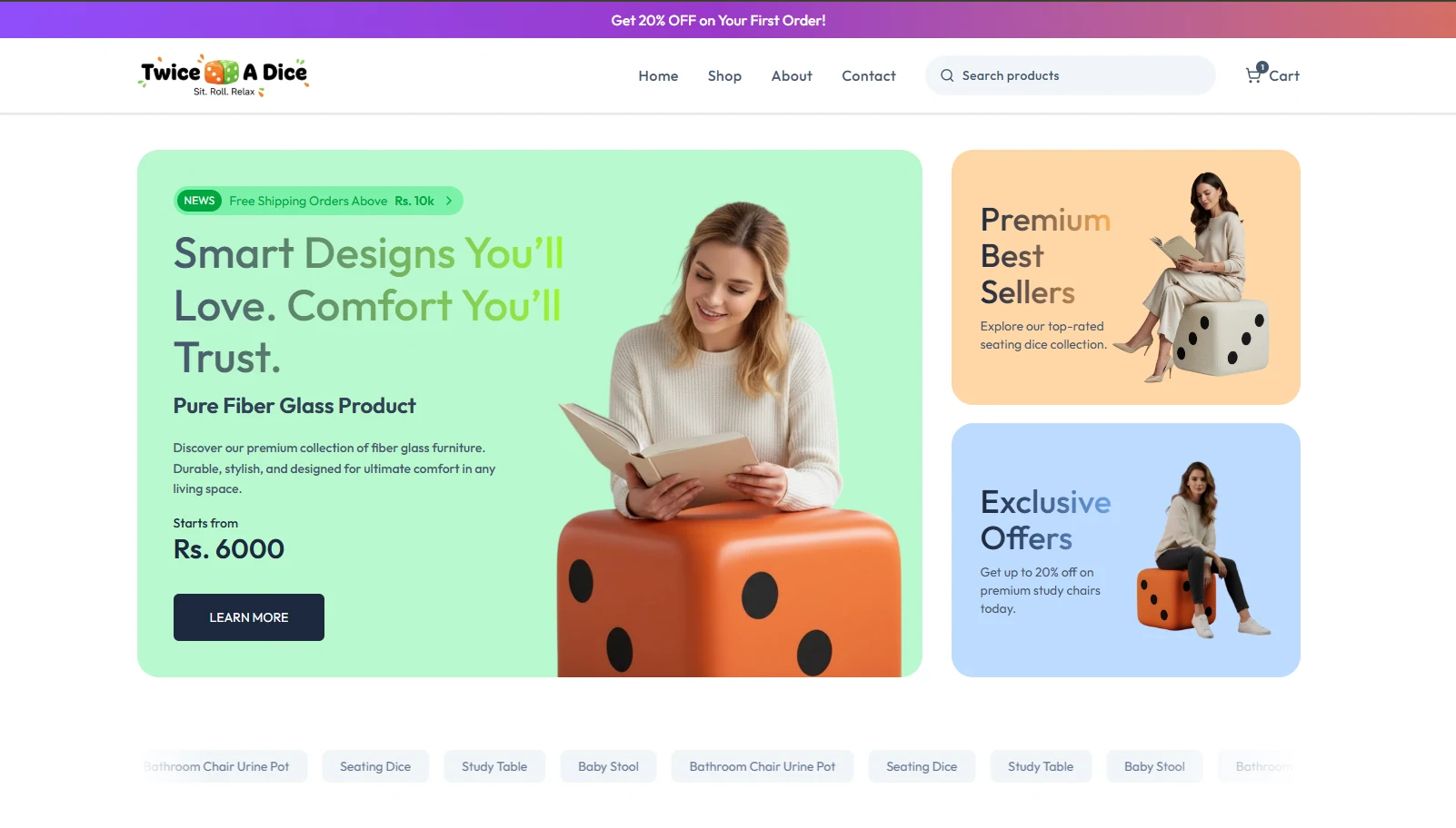
Twice a Dice is one of my personal frontend projects: an e-commerce storefront built around a cheerful brand and a clear shopping journey. I wanted the first screen to introduce the store quickly while making the product collection easy to find.
A playful storefront
The landing page uses bright color, product-focused panels, and clear navigation to give the store its own personality. Featured collections and offers help visitors understand what they can explore without making the page difficult to scan.
Keep product discovery simple
For an online store, the path from the homepage to a product matters. This project focuses on visible shopping routes, readable product groupings, and a responsive presentation that keeps browsing straightforward across screen sizes.
Twice a Dice was a chance to build a personal storefront experience from the visual direction through the key browsing screens. The live project is available from this article.