
Creating a Premium Storefront for Aura Watches
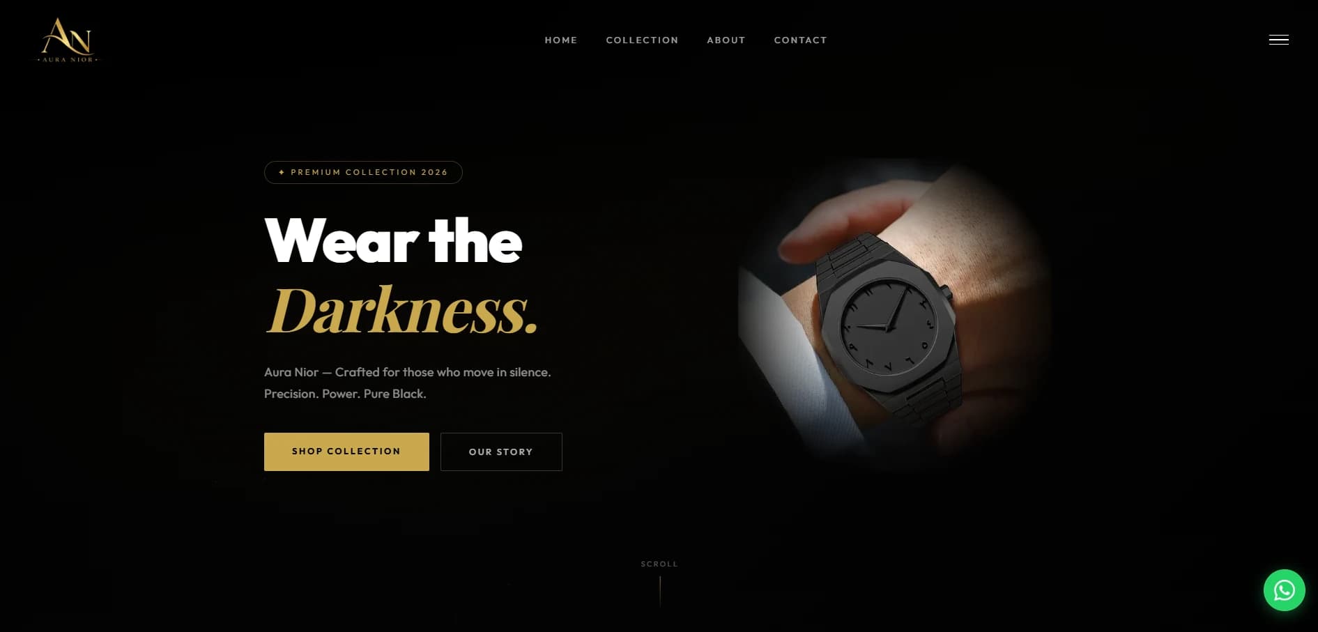
Aura Watches is a personal e-commerce frontend project for a premium watch storefront. Its visual direction pairs a dark background with warm gold accents, giving the collection a focused, refined first impression.
Let the product lead
The opening screen centers the watch and the collection message, with clear paths to browse products or learn more about the brand. This keeps the main choices visible while leaving room for the photography and product identity to stand out.
A considered shopping experience
Consistent typography, restrained color, and straightforward navigation help the different store sections feel connected. The goal was to carry the same premium tone from the landing page into the collection and product-browsing experience.
This project let me explore how visual identity and clear storefront structure can work together in a focused online shop. The live Aura Watches site is linked from this article.